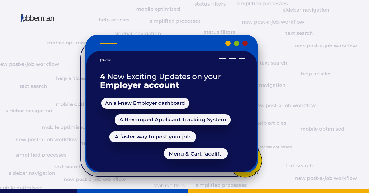
We’re thrilled to unveil an array of enhancements to our website designed to make your recruiting journey smoother, quicker, and more efficient than ever before.
At Jobberman, we’re committed to providing you with a platform that’s not just powerful but also user-friendly, and we’re thrilled to introduce these remarkable updates to elevate your experience.
So what’s new? Let’s dive in:
- Employer Dashboard Revamp: A Fresh Perspective
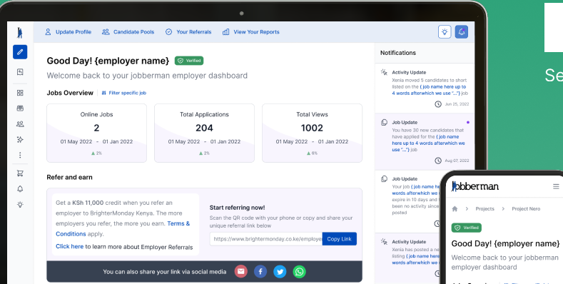
Say hello to a brand-new look and feel for your Employer Dashboard! Our responsive design ensures that whether you’re on a desktop, tablet, or mobile, your experience remains impeccable. The all-new app-like sidebar navigation eliminates menu clutter, allowing you to explore and accomplish more effortlessly.
We understand the importance of personalisation, and our platform adapts to your preferences, ensuring a tailor-made experience that’s second to none.
- ‘Post a Job’ Workflow: Seamless and Streamlined
Posting a job has never been this hassle-free! We’ve refined and focused the workflow, introducing a step wizard functionality that guides you through the process. This means quicker job listings and faster progress towards finding your ideal candidate.
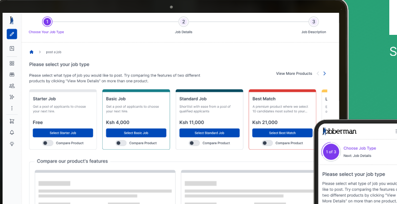
As you post a job, a dynamically scaled step-by-step indicator stays fixed at the top of your screen. No matter where you are on the page, you’ll always know exactly how far you’ve come. This ingenious addition ensures that posting a job is as effortless as possible.
- ATS Workflow: Where Efficiency Meets Elegance
Our ATS (Applicant Tracking System) has received a stunning makeover, complete with a responsive design that adapts seamlessly to screens of all sizes. We’ve listened to your feedback and incorporated it into a design that’s even more intuitive and user-friendly.
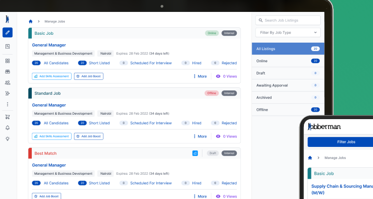
Managing your talent acquisition process just got even better. Now, you can search listings using text search, filter by status, and sort by listing time. Your control is unparalleled, giving you the tools to manage candidates precisely. Quick links and hover animations add finesse and convenience to your ATS navigation, saving you valuable time.
- Menu and Cart: A Whole New Perspective
The menu and cart sections have been given a fresh, contemporary touch. Our responsive design ensures you have an impeccable experience, no matter the device you’re using. The new app-like sidebar navigation lets you explore our platform seamlessly without the menu obstructing your view. A simple click on the side arrow collapses or expands the menu effortlessly.
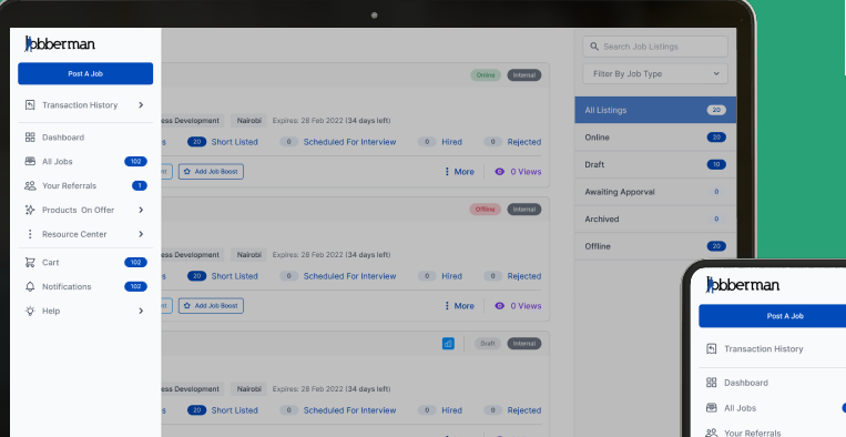
Notifications and help articles are now more visible and accessible than ever, putting the right information at your fingertips. And speaking of easy access, our revamped cart section ensures your product choices are displayed, making your decisions crystal clear.
At Jobberman, we’re dedicated to enhancing your recruitment experience, and these updates are a testament to that commitment. We’re excited for you to explore these changes and discover how they can streamline your recruitment journey.
Ready to explore the new updates?
See them here.

